Skeleton v0.92.0
Hey everyone, today's update includes a slew of new Elements and Components, as well as highly requested features such as Tailwind IntelliSense. This release also represents a huge leap forward towards our v1 milestones and roadmap.

News
Support Skeleton on GitHub Sponsors
We're happy to announce that Skeleton is now available to support through GitHub Sponsors.
You can also find us on Ko-Fi and Patreon if you prefer.
RSS Support for Blog
Thanks to @LukeHagar we now have an RSS feed for the Skeleton blog:
Release Notes
Release: (url)
Hey everyone, today's update includes a slew of new Elements and Components, as well as highly requested features such as Tailwind IntelliSense. This release also represents a huge leap forward towards our v1 milestones and roadmap. Given this, you may notice fewer library features introduced as we shift our focus to polish, refinement, and bugfixes. With the goal of reaching a stable Release Candidate in the coming weeks.
Summary
- 🧩 Tailwind Plugin Overhaul
- 💬 Tailwind IntelliSense Added
- ➕ Elements added for Alerts, Breadcrumbs, and Dividers
- 📙 New Table of Contents component added
- 🔲 New Chip elements and input added
- 🐞 Minor updates, bugfixes, and more
Tailwind Plugin Overhaul
https://github.com/skeletonlabs/skeleton/issues/650

After rigorous trial and effort we've overhauled the Skeleton Tailwind plugin to support a number of new improvements. The general idea is that Tailwind prefers all custom styling be provided to the plugin in "CSS-in-JS" format, which allows for features such as IntelliSense for the Tailwind VS Code extension. Given the scale and scope of custom styles within Skeleton, this posed some logistical issue that we had to overcome. We've detailed the changes below, along with a minor migration guide for existing projects.
Design Tokens
The Skeleton design tokens are made up of many repetitious classes with typically only a minor change - such as the color (ex: .bg-primary-50-900-token, .bg-secondary-50-900-token, etc.). Given this, the new plugin now dynamically generates these classes using a much more modular approach. These custom styles are then injected directly into the plugin which means we no longer have to import token stylesheets (ever), and the plugin immediately provides IntelliSense if you have the Tailwind VS Code extension installed.
Tailwind IntelliSense
While design token classes represent the majority of classes in Skeleton, you probably find yourself using element classes such as .btn and .card much more often. To provide IntelliSense for these classes, CokaKoala (aka @AdrianGonz97) has worked his magic to build a custom CSS to CSS-in-JS transpiler that inserts a version of these classes into the plugin purely for Tailwind IntelliSense support. This means we now provide 100% IntelliSense coverage for all Skeleton classes!
NOTE: Be sure give Adrian a pat on the back on this one, it was a heavy lift and he did an amazing job here!
⚠️ Migration Guide
If you don't already have the Tailwind Extension in VS Code, you can find it here. In your project, open tailwind.config.cjs in the root of your project and rename the old theme.cjs plugin to skeleton.cjs. As follows:
// Was
require("@skeletonlabs/skeleton/tailwind/theme.cjs");

// Now
require("@skeletonlabs/skeleton/tailwind/skeleton.cjs");
Then make sure to restart VS Code to ensure the Tailwind extension is made aware of the plugin changes.
Additional Tailwind Elements Added
https://github.com/skeletonlabs/skeleton/issues/756

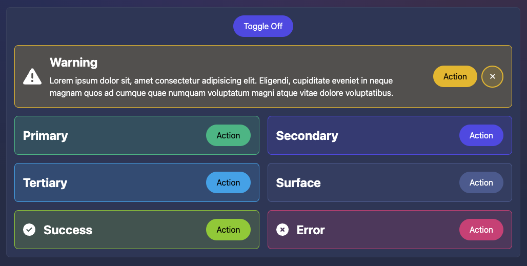
In Skeleton v0.41.48 we introduced the concept of Tailwind Elements, which are visual UI elements generated using HTML and CSS (via Tailwind). These provide a much simpler way to implement common features such as buttons, cards, lists, etc. In today's update we're converting even more Components to Elements, including:
Note that these should be visually indistinguishable from their component counterparts, but require no extra imports and are much easier to customize on-the-fly. Just mix and match utility classes as expected.
⚠️ Migration Guide
Warning - The component version of these features will remain for ONE more release. Please ensure you migrate ASAP.
Migrating Alerts, Breadcrumbs, Dividers
The process for converting from a component to an element is fairly straight forward.
- Consult the new Usage instructions per element feature (linked above) and follow the instructions provided
- We recommending adding your new Element alongside the component - its easy to compare side-by-side
- When ready, delete the component instance in your code
- Remove the
importstatement within the<script>tag on that page - Save your changes and ensure all looks well in your local server
Migrating Gradient Alerts
Unliked the above features, we feel the Gradient Headings can be easily recreated with pure Tailwind. We will not be providing a direct replacement, but rather suggest you recreate these using the @apply class technique shown here.
Table of Contents
https://github.com/skeletonlabs/skeleton/issues/357

Allows users to quickly navigate the hierarchy of page headings. This component will scan and auto-generate links based on the headings present on a designated portion of your visible page. This comes with a number of useful options, so please consult the Usage documentation to learn more.
Chips
https://github.com/skeletonlabs/skeleton/issues/375
Interactive elements for handling actions, selection, or filtering.
Chip Elements - docs

We've provided a variety of chip styles allowing you to create these elements on demand. See the various examples documented on the Usage page in the documentation.
Input Chip - docs

A dedicated Svelte component for handling multi-select in a single combined input. Options can currently be whitelisted and we plan to support the auto-complete feature in the future.
Minor Improvements
- Now including styles for the input color element as part of
forms.css:
https://github.com/skeletonlabs/skeleton/issues/376 - Modal now provide better responsive styling on small screens:
https://github.com/skeletonlabs/skeleton/pull/754 - New click to navigate feature added to the Stepper component:
https://github.com/skeletonlabs/skeleton/pull/752
Bugfixes
- Fixed a visual flickering bug when selecting inputs:
https://github.com/skeletonlabs/skeleton/issues/760 - Listbox now allows for
undefinedvalue by default:
https://github.com/skeletonlabs/skeleton/issues/759 - Temporarily reverted theme selection change to prevent warning:
https://github.com/skeletonlabs/skeleton/issues/770
Documentation
- Search has been overhauled with a new UI, UX, keyboard support, and better results:
https://github.com/skeletonlabs/skeleton/pull/757 - We now use Font Awesome for icons, if you're looking for a reference project:
https://github.com/skeletonlabs/skeleton/pull/749 - The Skeleton blog is now accessible on mobile devices:
https://github.com/skeletonlabs/skeleton/issues/744 - Avatar example options are now in the proper order:
https://github.com/skeletonlabs/skeleton/pull/753