Skeleton v0.124.2
Today's release represents the largest set of component updates in the project's history. Including a vast number of quality of life improvements, highly requested features, and several visual redesigns.

News
Skeleton on the LogRock Podcast
Skeleton's core maintainer Chris Simmons will be appearing on an episode of the LogRocket Podcast on February 15th. Be sure to tune in as we'll be sharing some exciting news about the future of Skeleton! You're not going to want to miss this!
Skeleton + Tailwind UI and Flowbite Guides
We've launched two new tutorial articles for converting Tailwind UI and Flowbite elements to Skeleton, taking full advantage of Skeleton's unique theme and design token system:
Release Notes
Release: https://github.com/skeletonlabs/skeleton/releases/tag/0.124.2
Today's release represents the largest set of component updates in the project's history. Including a vast number of quality of life improvements, highly requested features, and several visual redesigns. Unfortunately this does include a number of breaking changes, but gets us one step closer to our goal of a release candidate status for Skeleton.
Summary:
- ⬆️ Major component overhauls
- 🔲 Form components now support SvelteKit form actions
- 🅰️ Various Svelte action improvements
- ✅ Form styles now opt-in
- 🐞 Various bugfixes and minor improvements
⚠️ Migration Guide (DON'T SKIP THIS) ⚠️
Given the scale and scope of changes this release we've created a dedicated migration guide to help you transition your existing Skeleton projects to the new version. While we tried to preserve the existing component APIs, some of these changes were unavoidable. We ask that you please be cautious when updating to this latest release.
Component Overhauls - https://github.com/skeletonlabs/skeleton/pull/862
As mentioned in our last release, we've implemented a large series of updates and overhauls to all component in Skeleton. You may review a detailed list of changes here, but we've highlighted the most noteworthy changes below:
Accordions have been rebuilt from the ground up and now animate when opened or closed.

App Bars now feature multiple configurations, including a prominent headline slot.

App Shell now includes an on:scroll event handler to report the scroll position of the page.

File Dropzones have been redesigned, while remaining highly customizable.

Input chips have also been redesigned and feature animated effects as chips are added or removed.

Listboxes have been redesigned and are much easier to implement.

Steppers now use a horizontal layout (by overwhelming demand!) and implement a new abacus-like transition between steps.

Tabs are highly customizable, and feature an optional tab panel slot and hooks for improved accessibility:

Plus many many more changes. View the full set of improvements here, including details on breaking changes per each particular component.
Form Component Improvements
All of Skeleton's form components (ex: range slider, slide toggle, etc) have been updated to operate as native form inputs. Meaning they are plug-and-play when used within native forms in SvelteKit. To learn more, we've created a detailed tutorial article. If you use Skeleton forms in your projects you'll definitely want to review these changes:
Action Overhauls
https://github.com/skeletonlabs/skeleton/pull/862

As mentioned in our last release, Skeleton's Svelte Actions have been updated as we move towards a stable release. These now feature better examples and documentation per each. You may view the full set of improvements here.
Opt-In Form Styles
https://github.com/skeletonlabs/skeleton/pull/914

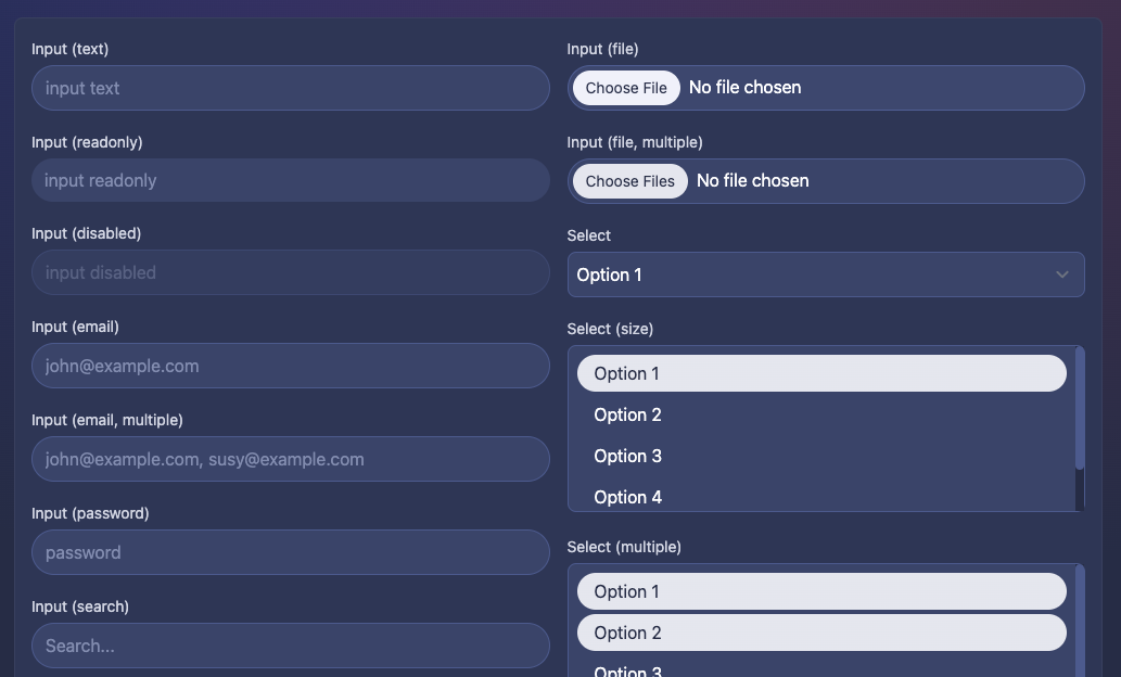
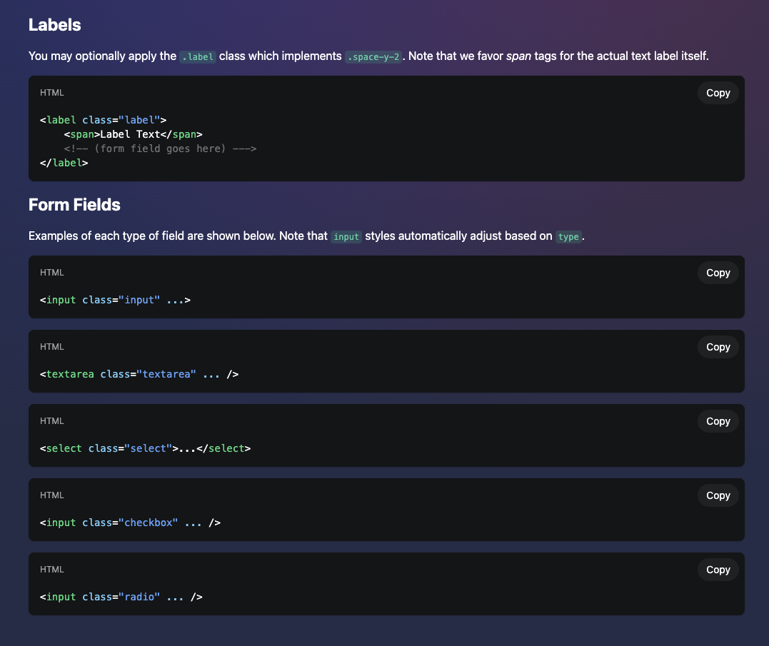
In the past Skeleton Form styles were globally on by default. This meant they were easy to get started with, but much more difficult to customize due to the complex CSS selectors required. As of this release, form element styles are now opt-in, meaning they require a class or set of classes to apply styles. This is the same approach used for buttons, cards, and other element in Skeleton.

We know adding adding classes takes additional effort, but this provides several immediate benefits:
- Form field styles are MUCH easier for the Skeleton team to maintain and extend.
- Form field styles are MUCH easier for you to customize using global overrides.
- Form fields are "naked" by default, making it easier to implement one-off styles as needed.
Please note the Tailwind Forms Plugin is still required and this applies some basic styles.
The other major benefit to this approach is it allow for the introduction of variant styles, such as this Material Design influenced variant shown below. Just append the .variant-form-material class to form element.

Data Tables Delisted

Please note that the data table features are slated to be delisted and we will no longer be providing support for these on GitHub or Discord. See the explanation here. Note that the data table features will continue to operate, but we will not be advertising this as part of our standard doc navigation. If you need to reference the documentation it can be found here. We will plan to bring data tables back, but not until we feel they are production ready. You can track progress on this here.
Minor Improvements
- Expanded our
package.jsonto provide more information on NPM:
https://github.com/skeletonlabs/skeleton/issues/881 - Component properties that represent CSS styles have a new dedicated type:
https://github.com/skeletonlabs/skeleton/issues/910 - Dropped the use of
crypto.randomUUIDwhich could cause build errors:
https://github.com/skeletonlabs/skeleton/pull/913 - Several component props have been updated to be more consistent:
https://github.com/skeletonlabs/skeleton/issues/917
Bugfixes
- Resolved a bug with the Toast
maxproperty:
https://github.com/skeletonlabs/skeleton/pull/923 - Explicitly set text-on-X-token in dark mode:
https://github.com/skeletonlabs/skeleton/issues/894 - Removed dark variants for Skeleton Tailwind IntelliSense:
https://github.com/skeletonlabs/skeleton/issues/888 - Resolved an issue preventing
.breadcrumb-nonresponsivefrom working:
https://github.com/skeletonlabs/skeleton/issues/889
Documentation
- Various visual updates and improvements based on the component changes this release
- Theme docs now have better instruction for the
data-themeattribute:
https://github.com/skeletonlabs/skeleton/issues/885 - Fixed an incorrect theme import reference: https://github.com/skeletonlabs/skeleton/commit/95afe76a26de1d70480285f31da34746981bdbb3
- Fixed typos and grammar:
https://github.com/skeletonlabs/skeleton/pull/896
What Comes Next
As with our last release, we wanted to inform you of updates coming down the pipeline. In order to reach our release candidate status we have two additional major updates slated:
- https://github.com/skeletonlabs/skeleton/issues/922
- https://github.com/skeletonlabs/skeleton/issues/783
These updates will be heavy lifts and require the majority of February to complete. If you're looking to contribute, please focus your feedback, testing, and support in these areas.
Support Skeleton
Wish to continue seeing large updates like this? Consider sponsoring Skeleton. You may contribute through a number of services: