How to implement a responsive sidebar drawer
In this tutorial we'll implement a set of navigation components that provide a different user experience for mobile and desktop. Desktop users will see a fixed sidebar, while mobile users will see an interactive drawer overlay.

In this tutorial we'll implement a set of responsive components that provide a unique navigation experience for mobile and desktop. Desktop users will see a fixed sidebar, while mobile users will see an interactive slide-out drawer. This allows for complex navigation menus that makes use of available screen space.
Find the source code for this project here:
 skeletonlabs
Note that for this tutorial we'll focus on SvelteKit, but most concepts should be applicable to Vite and Astro projects as well.
Getting Started
We'll need to create a new project. You can either follow the written documentation or use the brand new Skeleton CLI, which will generate a new SvelteKit project with Skeleton atomically preconfigured. For simplicity, we'll opt for the latter:
npm create skeleton-app@latest tutorial-skeleton-sidebarFor this project, let's use the following settings:
- Yes to Typescript Syntax
- No for ESLint, Prettier, and Playwright
- We won't need Tailwind Plugins, so hit enter to skip.
- Any theme is fine. We'll use the default.
- When prompted, choose the Welcome template.
We will then need to navigate into the project directory, open the project in your editor of choice, then start the dev server.
TIP: VS Code users can run code . to open the project source.cd tutorial-skeleton-sidebar
npm run dev
Navigate your browser to the localhost address shown in your terminal. http://localhost:5173/ is the default. You should see the new Welcome page below.
Prepare the Layout and Page
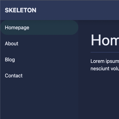
With our project established, let's open the homepage route in /src/routes/+page.svelte and replace the contents with the following. This will make better use of our horizontal space and indicate which page we're on.
<div class="container p-10 space-y-4">
	<h1>Homepage</h1>
	<hr />
	<p> Lorem ipsum dolor sit amet, consectetur adipisicing elit. Cupiditate nostrum, vero explicabo sunt ipsum asperiores. Molestias nostrum mollitia cumque veniam eum error atque, dolores nesciunt voluptas ea consectetur sed delectus.</p>
</div>
Next, let's open the root layout in /src/routes/+layout.svelte. Notice two Skeleton components have already been implemented:
- App Shell - a Svelte component which controls page layout.
- App Bar - a Svelte component for our header at the top of the page.
Add a Sidebar
The App Shell component provides multiple named slots. You'll note the use of the header and default page route slots in the current layout. Let's add one more – a left sidebar slot. Insert the following between the header and default slots.
<AppShell ...>
<!-- (Header slot w/ App Bar) -->
<!-- Left Sidebar Slot -->
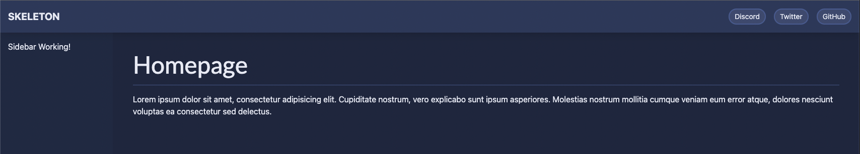
<svelte:fragment slot="sidebarLeft">
<p>Sidebar Working!</p>
</svelte:fragment>
<!-- (Default Page Content slot) -->
</AppShell>When we save our changes we'll see a the new sidebar appear on the left side.
If you used the CLI to generate your app you may see some default sidebar styles. Otherwise add these using the slotSidebarLeft prop as shown below. This applies several Tailwind utility classes.
<AppShell slotSidebarLeft="bg-surface-500/5 w-56 p-4">Shared Navigation Component
While we could hardcode our new navigation list directly into the sidebar, we really need something more portable. For this we'll generate a new Svelte component.
SvelteKit relies on the /lib directory to house local shared components, so let's create a new Navigation component in the follow location. Note that you may need to create the directories shown:/src/lib/Navigation/Navigation.svelte
Insert the following markup into the Navigation.svelte. This will make use of Skeleton's Tailwind Element list styles, including some basic hover styles.
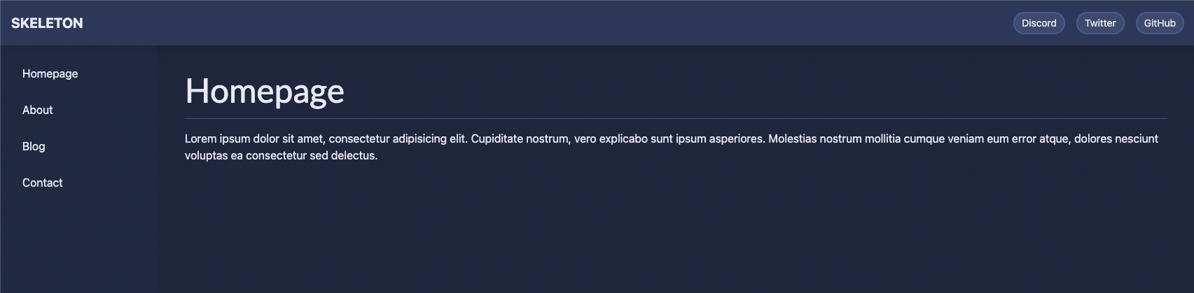
<nav class="list-nav">
	<ul>
		<li><a href="/">Homepage</a></li>
		<li><a href="/about">About</a></li>
		<li><a href="/blog">Blog</a></li>
		<li><a href="/contact">Contact</a></li>
	</ul>
</nav>
Open your root layout and import the new Navigation component in the script tag at the top.
import Navigation from '$lib/Navigation/Navigation.svelte';NOTE: If the Navigation import show a red underline error, restart the dev server. SvelteKit will see your new/libdirectory and automatically configure the$libalias path for your project.
Then replace <p>Sidebar Working!</p> with the Navigation component:
<svelte:fragment slot="sidebarLeft">
    <Navigation />
</svelte:fragment>
With all changes saved, we should see our navigation component on the page:
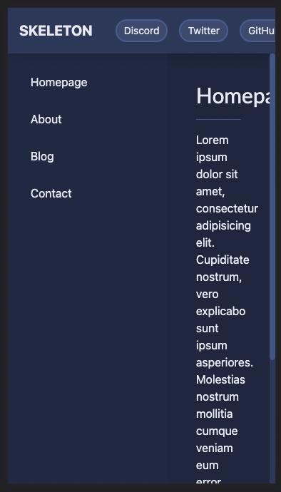
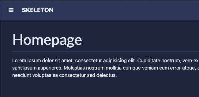
Unfortunately, if we resize the window down to mobile size, you'll note the page contents do not fit well due to our fixed sidebar. This is the issue we will overcome in the next few steps.
Responsive Sidebar Styles
To alleviate the issue above we'll need to hide our App Side sidebar on smaller screens. To do this, we can make use of Tailwind's media queries and utility classes. Since Tailwind is mobile-first, our sidebar will need a base width of w-0 (zero), then expand to w-64 (256px) when the window reaches the large breakpoint. Adjust your sidebar styles as follows:
<AppShell slotSidebarLeft="bg-surface-500/5 w-0 lg:w-64">p-4 padding class.Save the changes and try resizing the the browser width again. Now when the width is small enough the sidebar will automatically hide itself! However, this introduces another issue - with the padding removed, our navigation is bumping into the edges of the sidebar.
To resolve the padding, open your Navigation component and append the p-4 class to your NAV element:
<nav class="list-nav p-4">Save the changes and the spacing issue should now be resolved.
Hamburger Menu Button
While our desktop experience is great, we still need to provide navigation for our mobile users. For this, we'll need to implement a drawer component. But first, let's setup a trigger that will allow the drawer to show on demand - for this we'll use a hamburger button.
In your root layout, update the App Bar's lead slot with the following changes:
<svelte:fragment slot="lead">
    <div class="flex items-center">
        <button class="lg:hidden btn btn-sm mr-4">
            <span>
                <svg viewBox="0 0 100 80" class="fill-token w-4 h-4">
                    <rect width="100" height="20" />
                    <rect y="30" width="100" height="20" />
                    <rect y="60" width="100" height="20" />
                </svg>
            </span>
        </button>
        <strong class="text-xl uppercase">Skeleton</strong>
    </div>
</svelte:fragment>
Try resizing your window and you'll notice the button only appears when the window is below Tailwind's large breakpoint threshold. The button doesn't functionally do anything yet, but we'll change that in an upcoming step.
Drawer Component
Now it's time to add the drawer component and store. To match our sidebar, we'll want this to appear from the left side of the screen. Open your root layout file and let's implement a few changes.
First, let's bring in a few of our required imports:
import { initializeStores, Drawer, getDrawerStore } from '@skeletonlabs/skeleton';Then, let's make sure to trigger initilizeStores() to ensure our overlay stores are available. This is used to help prevent known SSR issues with SvelteKit. We'll also create an instance of drawerStore which retrieves our initialized store.
initializeStores();
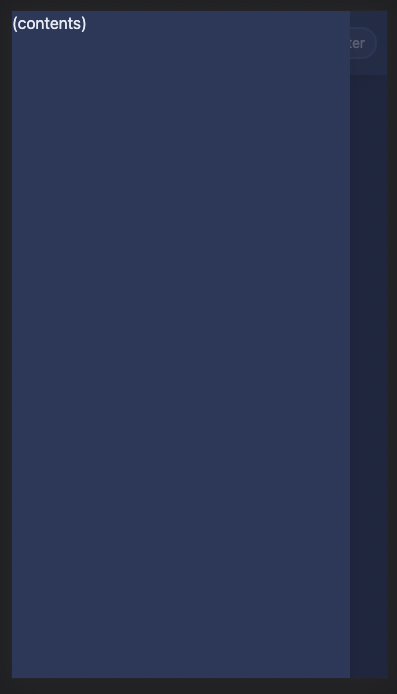
const drawerStore = getDrawerStore();We'll add the Drawer component directly above the App Shell since it's an overlay.
<Drawer>(contents)</Drawer>

<!-- (AppShell) --->
Save and preview your app, but please be aware you will not see the drawer immediately. This is due to the fact it is closed and hidden by default.
To change this, let's first implement a new drawerOpen function that triggers the drawer's open method via drawerStore.open({}). Add the following within the script tag in your root layout:
function drawerOpen(): void {
	drawerStore.open({});
}{} param in case we want to adjust the Drawer settings later.Finally, add a click handler to your new hamburger menu button to trigger this new function on click:
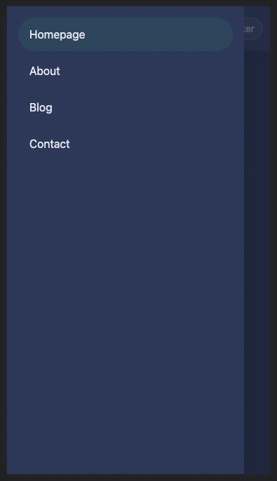
<button class="..." on:click={drawerOpen}>Now when we resize our window to a small size and tap the hamburger menu button the drawer should appear from the left side of the screen.
Add the Drawer
One final step remains, we need to add our Navigation component to the Drawer's default slot. To do this, replace (contents) with the following:
<Drawer>
	<Navigation />
</Drawer>
Save the changes and open the drawer to see the navigate component within the drawer.
While it may seem odd to have our navigation component in two places, the goal here is to centralize our navigation and keep maintenance minimal. Any changes within the Navigation component are immediately reflected for both mobile and desktop users. To see this in action, change the text of any of the existing links.
Going Further
Now that you've learned the basic concepts, lets explore advanced techniques using this system. The following is completely optional, but may prove useful for real world applications.
Unique Sidebar and Drawer Settings
Since the App Shell sidebar and Drawer utilize their own unique slots, you can take advantage of this to customize the surrounding content independently. Here's a quick example:
<Drawer>
	<h2 class="p-4">Navigation</h2>
	<hr />
	<Navigation />
</Drawer>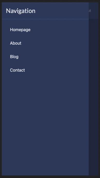
Note that it's also possible to pass unique props values to your custom Navigation component in either slot location.
Close the Drawer on Selection
If you tap the homepage link within the drawer the drawer will currently remain visible. This is not the expected user experience.
Let's open our Navigation.svelte component and append the following within a script tag at the top of the file:
import { getDrawerStore } from "@skeletonlabs/skeleton";

const drawerStore = getDrawerStore();

function drawerClose(): void {
     drawerStore.close();
}Finally, let's create an click handler for elements that we wish to close the drawer:
<li><a href="/" on:click={drawerClose}>Homepage</a></li>
<li><a href="/about" on:click={drawerClose}>About</a></li>
<li><a href="/blog" on:click={drawerClose}>Blog</a></li>
<li><a href="/contact" on:click={drawerClose}>Contact</a></li>
Now when we click an anchor the drawer will auto-close itself.
Selectively Disable the Sidebar
You may have noticed the desktop sidebar selectively appears only on certain pages for the Skeleton website. It is hidden on the homepage and blog, but appears on any documentation section. We accomplish this using SvelteKit's $page store, which provides the current route URL.
To imitate this in our tutorial project, let's create a second page within our app. Copy /src/routes/+page.svelte to /src/routes/about/+page.svelte, then change the page H1 tag text to "About". This will allow us to navigate between the Home and About pages in our navigation menu. Go ahead and navigate to the About page for the following step.
Next, let's disable the sidebar only when showing the homepage. In your root layout, import the SvelteKit $page store in your script tags at the top of of the script tag:
import { page } from '$app/stores';If we were to console log $page.url.pathname we would see different results for either page in our browser:
/will be logged for the Home page./aboutwill be logged for the About page.
Given this knowledge, we can use a Svelte reactive property to monitor changes to the $page store, then adjust styles for our App Shell sidebar as needed. Add the following to the script tag in your root layout:
$: classesSidebar = $page.url.pathname === '/' ? 'w-0' : 'w-0 lg:w-64';/ then set the former styles, else the latter.Then modify the App Shell sidebar classes to use the dynamic values:
<AppShell slotSidebarLeft="bg-surface-500/5 {classesSidebar}">Now when we navigate between the home and about pages our left sidebar will adjust accordingly. However, on mobile, we retain access to the hamburger menu and drawer navigation at all times.
UX Considerations
While the responsive sidebar drawer is useful, it's worth noting this is one of many navigation patterns available. It's up to you, the developer, to decide what works best for your project and users. Alternatively, please consider the following suggestions: